Platts 'Global Gas Platform' provides the North American and European gas markets, with critical market data, price assessments, industry news and analysis to meet the business needs of traders, risk managers and market analysts.
The platform had recently gone through a visual redesign which had yielded marginal improvement in performance, which according to user feedback, was critically poor. I was brought in to review the platform and improve the user experience.
My first thought was to find out from the user how, what for, how, where and when they used the platform. Using existing platform data and analytics to make some early assumptions. What are the drop off points, which pages have the highest journey termination, what functions have the highest number of complaints.
Documenting user behaviour by observing them in their usual environment.


Reviewed and analysed competitor' platforms.


A prototype was built rapidly in Axure to present to the team and to end users.

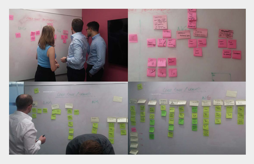
Built the navigation into a test model. We gave tasks to users could see if they could fulfil tasks given specific scenarios.


The re-designed navigation for was tested with users which resulted in improved navigation efficiency. User were able to complete the user journey 70.9% of the time as against 29.41% from the existing menu system.
Are you working on something great? I would love to help make it happen! I am interested in roles that require creative thinking and practical solutions. Drop me a line or two and let's get talking!